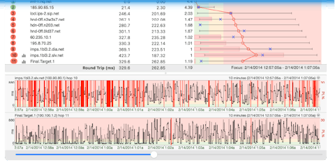
The PingPlotter Interface
Behold! Before you is the PingPlotter Interface.
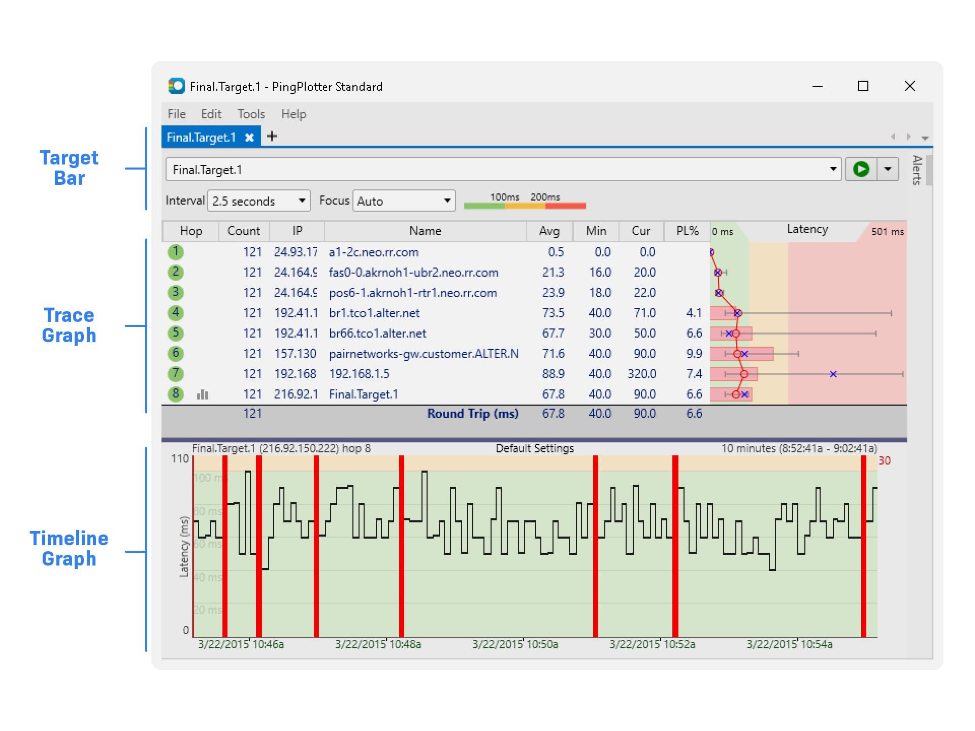
It’s not as scary as it looks. Each part of the interface helps you narrow down your issue:
- The Target Bar has everything you need to run the best trace possible.
- The Trace Graph shows us the ‘map’ of all the hops between you and your destination, as well as some details on how they’re performing.
- The Timeline Graph shows network performance over time, so you can better understand the when behind the why.
See? Not so scary.
So, let’s dive in! First, we’ll look at that Target Bar…