Finding the source of the problem - part 2
Let’s apply and build on what we've learned and dig deeper.
The black line on the Timeline Graph shows you the latency over time. As you zoomed in on the graph earlier you saw that really what you’re seeing is pixel-wide entries that represent the round trip time, or latency for the host/device who's Timeline Graph you’re looking at.
Red, on the other hand, represents packet loss (PingPlotter didn’t get anything back). We have numerous articles that go over different reasons why you could see packet loss in the Knowledge Base at www.pingman.com/kb. Our goal here is to help you understand at a basic level how PingPlotter can help you figure out why that loss is happening.
Packet loss, of course, isn’t the only thing that can cause poor performance for your particular application. The other big factor is latency. For online games, for instance, latency is a killer. Let’s review our sample data, and look at a trouble spot so we can learn more how to interpret what PingPlotter gives us that no other tool can.
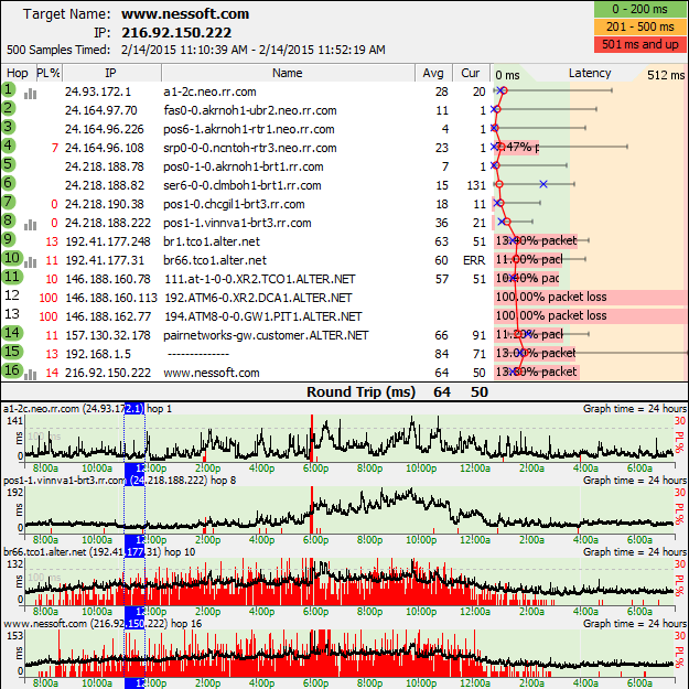
Let’s look at the time period between 11am and 12pm on February 14, 2015. Let’s take the approach that we were browsing the web at that time and were running pcAnywhere into our computer at work. The pcAnywhere session goes to pot.

1. Set "Samples to Include" to a number between 100 and 500 (we're using 500 here because it's easy to see the focus period on the 24 hour graph).
2. Change the Timeline Graph scale to 24 hours (remember: right-click then pick 24 hours), and then scroll all the way to the beginning of the graph
3. Take a look around at that time between 11:00 am and 12:00 pm. Double-click a time period somewhere around the 12:00 pm time. You'll notice the focus lines appear on the time graph, and the upper graph will show packet loss.
4. Wow, look at that packet loss! 13% at hop 9, 14% at hop 16. Notice how the packet loss is added at hop 9, and then all the downstream hops also show high packet loss. This is a strong (compelling, in this case) indicator that hop 9 (or the link between hop 8 and hop 9) is the reason we're seeing packet loss.
5. Notice the packet loss trending over time. This indicates some kind of time-based load problem. Also, the fact that the packet loss starts at the junction point between rr.com and alter.net indicates a possible problem at the connection between these two providers. It's possible that rr.com doesn't have enough bandwidth to service needs.
6. Let's turn on a couple more timeline graphs. Double-click on hop 9 and hop 8. Notice the difference in packet loss. Notice, too, that the latency is still relatively high, even at hop 8, and it's also showing time-based problems. Double-click on hop 1, and notice that that *to* also shows a time-based latency problem. This is a separate problem from what we're seeing at the hop 8 to hop 9 junction point! Looks like we should contact rr.com and find out if they can help us solve this problem!
7. Try zooming in on a problem-period by changing the timeline graph scale to something lower. When you see an interesting period, double-click on it to "focus" it, and then change the timeline graph scale to zoom in or out. This gives you a close-up view of the data with more detail.
Now, it should be noted that spikes on your graph may not be really high latency. A spike in the graph is high latency for that period displayed on the graph. The Timeline Graph auto-scales itself, so to see what that high spike is you need to look to the left-most part of the Timeline Graph. In this case the value we’re looking for is 87ms.
This was a really quick example of moving around within PingPlotter and digging out information about not only what’s going on with a connection, but really focusing in on a problem. Let’s move on now and talk about collecting this data over time and preparing a good case for your ISP (or someone able to solve this problem!).

