Legacy Manual
Interpreting Results - Longterm Monitoring
PingPlotter allows you to use the timeline graphs to zoom in on any particular time, so even if you weren't there (or didn't save an image) when something was happening, you can still recover that exact image later. You shouldn't ever have to be sitting in front of your computer when an outage happens, or you experience other problems on your network, to get the data you need from PingPlotter.
The Scenario:
You're having outages (or situations you want to communicate to your ISP) randomly throughout the day (let's say twice a day). The problem is that you can't be there every time an outage happens so you can save a graph image.
For this example, you're keeping 24 hours of data in memory or even more. We suggest that you normally use 2.5 second trace intervals and keep 200,000 samples in memory (this is almost a week's worth of data). You can change the number of samples to keep in memory in the Auto-Save section under the Edit/Options menu selection.
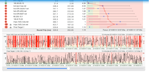
Using PingPlotter's timeline graph, you can see over the past X time period (see below) to identify a time period where there was problems. Problems will demonstrate themselves as packet loss (red), or high latency.
Now you want to show the route, and the packet loss/latency in the upper graph for that time period. Since that time has already passed, you need to change the focus of the upper graph to that time in the past.
![]() First off, you need to make sure your "Focus Time" focuses in on just the period in question, so let's change that to 100 (it's important to not have it set to 0/all, but to have it be a number smaller than the number of samples in memory to be able to focus the upper graph). Right click on the timeline graph and pick a reasonable period of time to set the viewable time period. For instance, you may want to set it to six hours so you're not scrolling forever. You can then "click and drag" the graph to the left to go back to the time period you want to focus on and drag it to the right to go forward in time.
First off, you need to make sure your "Focus Time" focuses in on just the period in question, so let's change that to 100 (it's important to not have it set to 0/all, but to have it be a number smaller than the number of samples in memory to be able to focus the upper graph). Right click on the timeline graph and pick a reasonable period of time to set the viewable time period. For instance, you may want to set it to six hours so you're not scrolling forever. You can then "click and drag" the graph to the left to go back to the time period you want to focus on and drag it to the right to go forward in time.
Double-click on the "problem period" in the lower graph. You'll see a focus rectangle appear on the lower time graph, and the upper graph will change to represent the data you have "focused" in the lower graph. Once you've done this, you might want to change the scale of the lower graph to show more detail. Right-click on the lower time graph again and change the scale to an hour (or maybe even 30 or 10 minutes depending on how long the outage was). The focus rectangle should still be visible. You can fine tune the data being displayed in the upper graph by double-clicking on the lower graph again.
Using these techniques, you should be able to zoom in on exactly the right data to best illustrate the problems you're seeing. You can look at the data after the problem occurs and get the perfect picture and not have to sit there watching PingPlotter all day and night.
You can auto-save that data by for instance having the auto-save function in PingPlotter create new files every day, and then load up a prior day to do the same thing you did above for a particular time. This gives you the capability to have pretty close to 100% coverage of your network performance and be able to zoom in on any particular outage, period of slow response, etc.
The options in the alert setup do allow you to have the .PP2 file (trace data) emailed, and then you can use these same capabilities to zoom in on that data.