Version 5 Manual
Finding the source of the problem
We learned how to do a basic PingPlotter trace in the previous exercise. What we want to do now is take a pre-prepared save file that contains about 2 ½ days worth of fictional data and do more hands-on work with PingPlotter.
First off, you need to get the data file downloaded for this exercise. The file you need to download is at www.pingplotter.com/files/sample-data.pp2. Save this file to your desktop so it will be easy to find (of course you can select another location - just remember what you specified).
Load up the save file in PingPlotter by going to "File" -> "Load Sample Set," and then browse to your desktop (or wherever you saved the nessoft.pp2 file) and select the sample-data.pp2 file, then click the "Open" button. Ta da! Two and a half days worth of data for us to play with.
Let’s go over some concepts concerning the Timeline Graph.
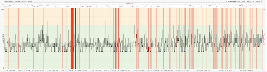
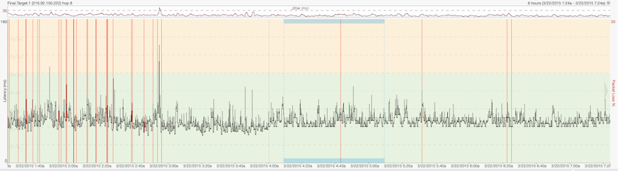
Let’s start out with this concept – red on a graph is bad. All those red lines you see on the Timeline Graph indicate Packet Loss for that particular time period. Remember, that means that PingPlotter didn’t get an answer back. There are times where you could have a flaky router, or even a server that is de-prioritizing ICMP packets. If you’ll remember from the How PingPlotter Works section, this is how PingPlotter gets its information. You could have a perfectly fine connection through that router, but PingPlotter will show it at 100% packet loss. For the most part though, when you see red on the Timeline Graph it means PingPlotter wasn't able to get to that server.
The black line on the Timeline Graph is average latency for the time period you’re looking at. When you zoom in on the graph throughout the next two steps you’ll be able to see the individual pixel-wide points on the graph.
The default Timeline Graph scale is 10 minutes - but what if we want to see more? Right-Click with your mouse button on the Timeline Graph, and you’ll see that you can show anywhere from 60 seconds on up to 48 hours worth of data within the Timeline Graph. Go ahead and select 6 hours. Notice that you’re now looking at six hours worth of trace data.
Feel free to select different time periods and see how the contents of the Timeline Graph reflect what you select. What we want to illustrate here is that via the Timeline Graph’s right-click mouse menu, you can easily zoom out to look at a trend for a day, and then zoom in to a spot that looks interesting – down to 60 seconds worth of data.
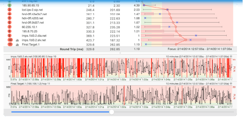
The Focus Period
The "focus period" on the Timeline Graph (double click anywhere on a Timeline Graph) shows you the current sample set that you’re viewing.
Remember that value is set in the "Focus Time" value. When you first load up this save file, PingPlotter is starting at the last trace done before the data was saved, going back 10 traces, and then calculating the values for the Trace Graph based on that value. Note also that PingPlotter shows you the date and time information for the sample set that you’re looking at in the area up above the Trace Graph.
You can change the focus of the Timeline graph, and subsequently the data in the Trace Graph, by double-clicking on any area of the Timeline Graph you want to look at. In case you’re wondering, you can have an active trace going while you move around the Timeline Graph. You do not need to save the data, stop the trace or do anything else for that matter. Just double-click on the area you want to see.
Now change the Focus Time to 60 minutes. See how the values in the Trace Graph change to reflect those additional 60 minutes? Change the Focus Time to ALL. Whoa! If you look at the Sample Set Time above the Trace Graph you’ll now see that you’re looking at a lot of data. In fact, you’re looking at all 44,843 traces, or ALL of the traces that were in the file we loaded. Your PL% and Avg columns in the Trace Graph now reflect all those traces. Now you can change it back to something smaller.
If you’re not there already, right-click on the Timeline Graph and set the time you want to see to 6 hours. To move back through the data you click-drag, or left-click, and while the left button on your mouse is held down you move the graph to the right. To move forward in time, you click-drag to the left. Are things starting to “click," as far as how you can move back and forth through time on the Timeline Graph? If you have a lot of samples to move through, do yourself a favor and set the graph scale accordingly (again, by right-clicking and choosing a time) before you do. For instance, if you’ve zoomed in to where you’re looking at 5 minutes worth of data and then need to go back twelve hours – set your graph scale to something like 3 or 6 hours before you start.
Tip: You can also use the keyboard to navigate backwards/forwards, as well as quickly get to the beginning or end of Timeline Graphs. The shortcut keys used to do this are covered in the Interface Graphs portion of this manual.
Hopefully by now you’ve been clicking all over the Timeline Graph, and seeing that the Timeline Graph does indeed change when you select a new sample set to look at. So how do you get back to the current time/date? Bring up the Timeline Graph’s right-click menu and select "Reset Focus to Current." If you don’t see that listed in your right-click menu….well, then, you’re already current.
At this point if you’re thinking, “Hmmm, this Timeline Graph stuff is cool, but I want to see a Timeline Graph for Hop 1 too!”, then today is your lucky day. You can do this by double-clicking on that (or any) hop - or by right-clicking and selecting "Show Timeline Graph." Double-clicking again will hide that same graph. If you have a lot of Timeline Graphs open, clicking once on the hop for that Timeline Graph will cause that Timeline Graph to flash briefly so you can pick it out of the list.
Summary
You can change the scale by right-clicking and selecting one of the values listed.
The focus area on the Timeline Graph shows you the current sample set, and you can change it easily to reflect the time period you want included in the Trace Graph.
You can move around within the Timeline Graph by click-dragging or using the shortcut keys.
By changing the graph scale, click-dragging then changing the scale back, you can zoom in and out of different time periods you want to analyze.
PingPlotter tries to keep your "focus period" in view on the timeline graph, and you can use this if you're zooming in on a period. Focus the period you're interested in (double click on it), and then zoom in.
If you want to get up to the very last sample set in a save file, or the last sample done if PingPlotter is actively tracing a target site for you, “Reset Focus to Current” on the right-click menu for the Timeline Graph will get you there.
If you want to turn on or off visibility for a Timeline Graph for a hop, you can do so by double-clicking that hop, or by right-clicking on that hop and selecting “Show this Timeline Graph”.
To quickly find a Timeline Graph for a particular hop, if you have a lot of Timeline Graphs showing for instance, click once on that hop and the associated Timeline Graph will flash.