Version 5 Manual
Timeline Graphs
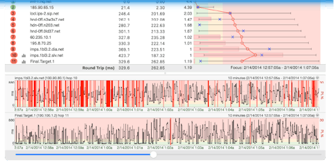
Network problems can often happen when you’re not watching for them. The timeline graph feature in PingPlotter gives us a quick way to look over a visual representation of our trace data. This makes spotting problems (or potential problems) much, much easier.

By default, PingPlotter will automatically trace the last hop (the host you’re tracing to) on a timeline graph.
In PingPlotter Standard and Pro you can also display a timeline graph for any of the other hops in a route by either double clicking on that hop, or right clicking and selecting “Show this timeline graph.” You can also turn off any graph by these same mechanisms.
The amount of data displayed on the graph can be changed, too - just right click anywhere on the graph and select the amount of time you’d like to display (this will affect all timeline graphs and is saved when you shut down PingPlotter).
Navigation
If there is more data collected than we can show on a timeline graph (for example, if you’ve got 48 hours worth of data, but have your graph scale set to “10 minutes”), you can click (and hold down) your mouse button on the graph, and drag it back and forth. This allows you to move back in history and examine the samples during those times.
On Windows, if you click on a graph and scroll down, you’ll move back on the time graph, scrolling up will move the graph forward. If you click the scroll wheel, scrolling up or down will toggle through the time period options on the graph (so you can basically zoom in, or zoom out using this method). On Mac, with a magic mouse you can hold a left click and scroll to zoom in/out on the timeline graph.
Comments
If you’re using PingPlotter for long-term monitoring, you may sometimes run across a situation where your network was effected by something you know about (power outage, big file download, that time you threw your router out the window, etc). You may also run into situations that you don’t control, but know the cause of (or can speculate on). Being able to take notes about these situations and tie it to your data can prove to be very, very helpful.
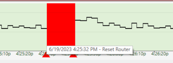
To create a note, all you need to do is right click on a timeline graph (at a point you want to create a note), and select the “Create Comment” option. A prompt will appear asking you to create your comment, and then PingPlotter will draw a red triangle on the lower edge of the timeline graph. If you float your mouse over the triangle you can see the note:

Right clicking on the comment triangle will also allow you to edit or delete it.
When you save data as an image from PingPlotter, your comments will get attached to the image (along with the times they happened). If you’re sending a image to a network provider, this can be especially valuable - as it helps explain the events on the data that you’re sending to them:
The Focus Period
Any time you double click on a timeline graph, a blue “Focus Period” will appear, which focuses the upper graph to that point in time. This focus area is based off of the “Focus Time” value (and this won’t work if you have this value set to “ALL”).

If you’ve got your graphs set to show 48 hours worth of data, and if you find a time period that looks like it might be interesting, you can double click on the timeline graph at that point and the trace graph will move to that time period as well. You can then change your timeline graph scale, and the lower graphs will stay focused on the period you selected. This makes it easy to spot, and zoom in on problems.
When you’re finished going through your graph history, you can reset everything to display your current results by right clicking on a timeline graph and selecting “Reset focus to current.” This returns both of the graphs to, you guessed it, the current time.
**Some of the features listed in this topic are only available in PingPlotter Pro and/or PingPlotter Standard. See our product comparison page for more details**

