PingPlotter Cloud Manual
Insights
Insights is an automated analysis tool that looks at your PingPlotter trace results and identifies where (and in some cases, what) problems are impacting a device’s connection.
With Insights, you and your team can scrub through days worth of data in an instant to find incidents and diagnose issues. In addition, Insights analyzes the data itself to help support take the right action and avoid false positives.
Using PingPlotter Insights
To begin, simply open the Target View for a trace (this includes paused traces and older sessions). In the upper-right corner, click on the Insights button to begin the analysis.
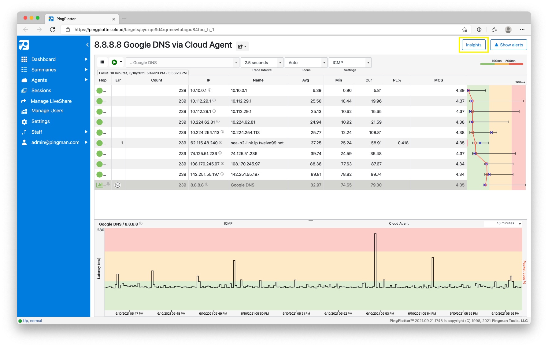
Insights will open in a split-view on the right, analyze the last 24 hours of collected data for the current trace, and identify when and where PingPlotter recorded potential issues.
Change the analyzed time range using the dropdown. You can analyze the last 24 hours, 48 hours, or 7 days. To analyze a custom time range, use the Timeline Graph to set the desired range, and then select Visible Timeline from the dropdown.
Understanding the Results
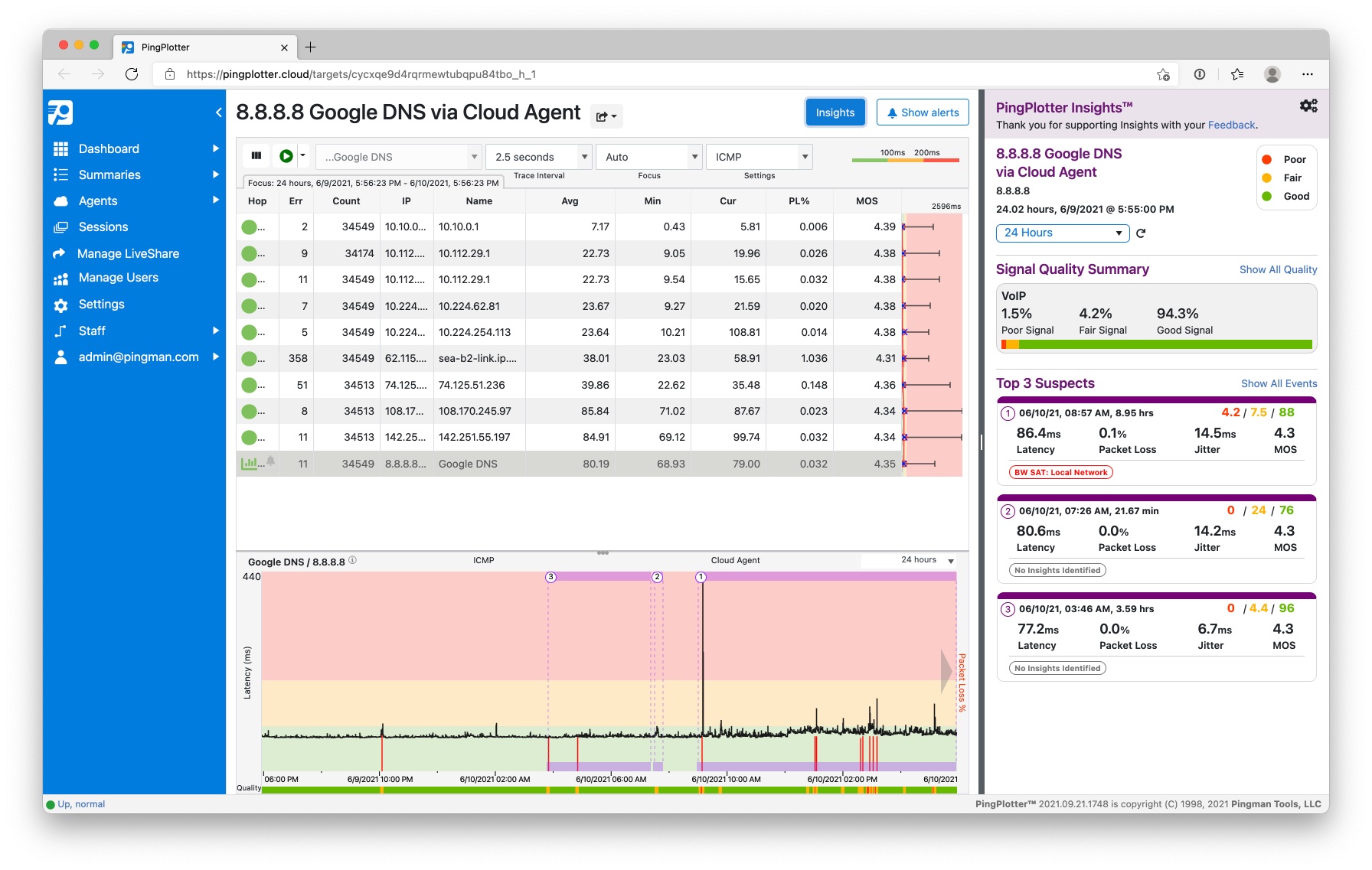
Signal Quality Summary
The Signal Quality Summary shows the results of the Quality Score Definitions. Select Show All Quality to see the results for all Quality Scores. Click on a service to change the Quality bar below the timeline graph.
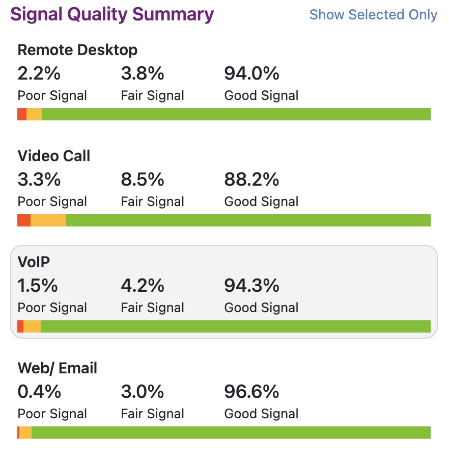
Insights categorizes the results as Good, Fair, or Poor and displays these as a percentage. The percentage shown is a percentage of the analyzed time range. If I analyzed 100 minutes, and I get 50% good signal, that means for 50 minutes my signal performed well enough for the selected Quality Definition (e.g. VoIP).
Top 3 Suspects
Along with determining Signal Quality, Insights will also scan the data to find significant network events that could have contributed to poor Signal Quality. The Top 3 Suspects are the 3 events Insights determined to be the most significant events. These are shown in the Insights panel as event cards and highlighted in purple on the timeline graph.
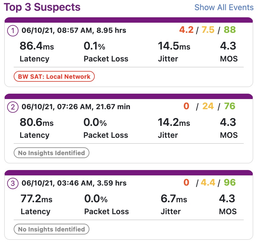
In each event card you'll find:
- Date, Time, and Duration of the event
- Quality Score Percentages during the event
- Average Latency, Packet Loss, Jitter, and MOS
- Possible culprits such as Local Bandwidth Saturation
Click on a card to zoom in on the event and get more details about the likely culprit. Select Show All Events to see every network event Insights detected.